Author Archives: Elizabeth

About Elizabeth

My work is based on simple and practical shapes-- a bowl for fruit, a plate for food, a vase for flowers-- though I strive at the same time for a certain lightness and elegance of form. Once the piece has taken form, then I try to push it beyond the limits of the ordinary, pulling the clay to distort it and deliberately or spontaneously layering or splashing on contrasting colour to fuse with the shape and catch the eye. When a piece comes out of the kiln, it pleases me if it makes you think of a nicely laid table and at the same time of surfaces marked by the wind, water and sun, like a rock or the face of a cliff or the trunk of a tree.

Lidded pots

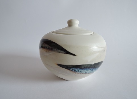
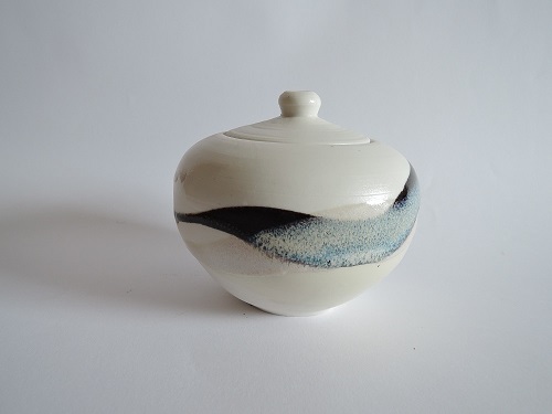
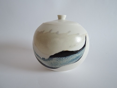
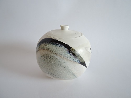
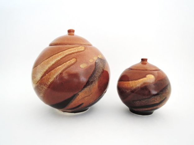
Am pleased to have these two lidded pots exhibited at Galerie Côté Créations for the month of August, as part of our Ottawa Guild of Potters’ monthly showcase.

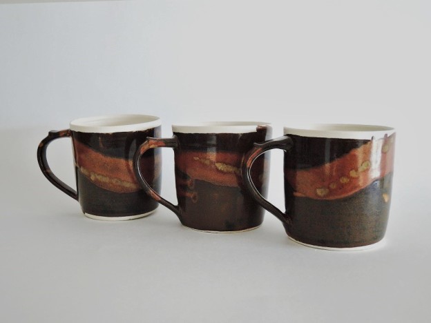
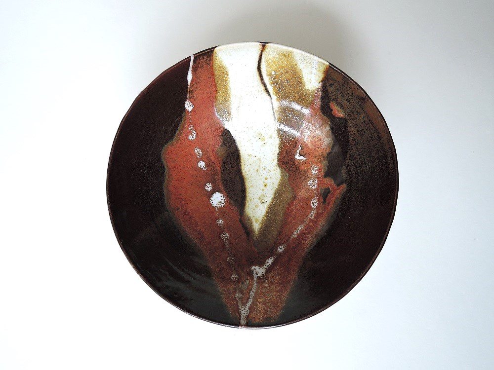
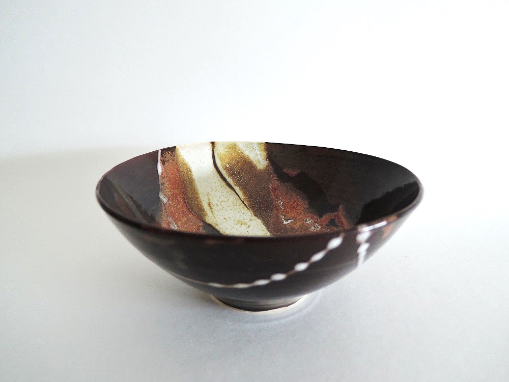
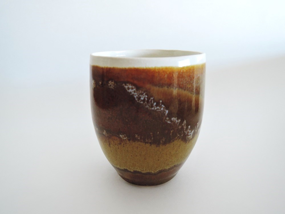
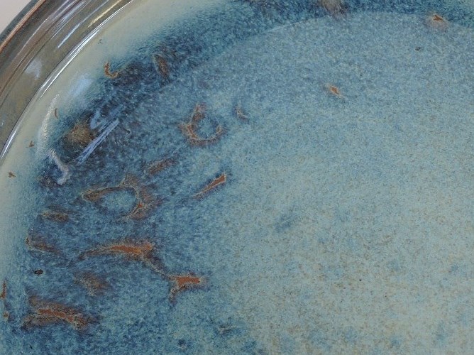
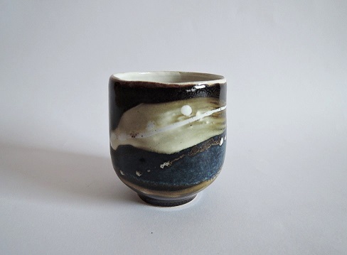
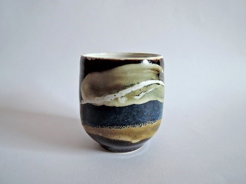
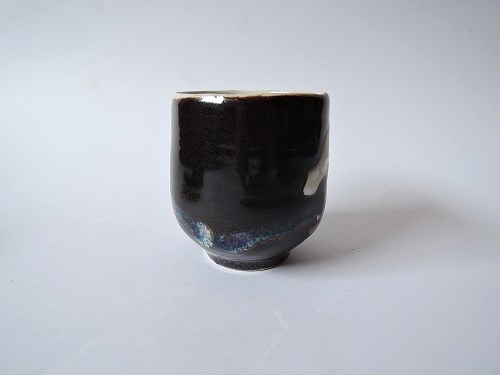
I’ve always admired the British potter Adam Buick’s moon jars, based on the traditional Korean spherical moon jars.  I have added a lid, to make a true sphere that I can use as a canvas for my multiple layers of trailed glaze. I used two glazes as the first covering, one using ochre to get the nutmeg, the other with oxides of iron and cobalt to produce the deep black. Then a wide squirt of a titanium oxide-rich glaze which works well over both these glazes, even where the previous two overlap; the titanium dioxide tends to have a slightly chrystalline effect, providing a nicely contrasting, grainy, light golden band of colour.

I took a big risk with these, and refired them, as in the initial firing the glaze did not fully cover the edge of the rims. The pieces held up nicely to this additional stress. Even better,  the second firing gave the nutmeg a higher gloss and a deeper, richer colour.

Porcelaneous stoneware, fired to Cone 6; in oxidation.

Three Down-to-Earth mugs

Using “Bright White” porcelaneous stoneware for these mugs, I’ve glazed the inside and the rim with a plain transparent glaze. For the outside, I used the same glazes I’ve used for the wide, distorted bowls, but here on a vertical surface. I love the tension of choosing the appropriate nib for the slip/glaze trailer, setting out a big bowl to catch the drips, holding the mug in what I hope is exactly the right position, then squirting the glaze and watching where it runs over the curved surface. Needless to say, even after years of practice, it doesn’t always do what I had planned. Did I plan for the Bailey’s Red to creep over the top border and into the transparent at the rim? Well, no. But then maybe it is the unexpected that adds that extra little something. At least that is what I am telling myself…

Porcelaneous stoneware, fired in oxidation, to Cone 6.

Flotsam

From yesterday’s kiln; a small bowl, as a test for a couple of big bowls that are just out of the bisque kiln. These new ones I’ve made much wider and shallower, hoping that applying the trails of glaze will then be less treacherous. With the  sharper curve as seen here, if the glaze is just a little too wet, it tends to break away from the sweep of the line, creating a new, discordant line downwards… Washing everything off, and starting over, is time consuming and more than a little frustrating. I’ve added a sprinkling of white to the outside, as a link between the inner and outer surface.

Di: 15 cm, ht: 6 cm. Cone 6, porcelaneous stoneware.

Flotsam-side-5april2017DSCN4912

Goblets – Caramel

I am still working my way to attractive, reliable glazes that work well in combination, here in my new environment at Gladstone Clayworks. I am not there yet, but I feel I am making progress. In contrast to the distorted bowl I made earlier this month, this time I dipped the pieces first in a transparent/white glaze before applying the dark, iron-rich glaze. This combination turns dusty brown (of the bowl) to a much lighter, caramel-like colour. On the one side, over that, a wide squirt of a white gives the caramel an even lighter, more golden tone; on the other side, the squirt of Bailey’s Orange Red gives some red, but far less than in the distorted bowl. The last, very thin squirts of my old faithful Blanc Beurré (from former Brussels days), kept it’s line nicely where it fell over two layers of glaze. However, not surprisingly, it ran badly where it fell over the broad squirts of the white and the Bailey’s; here the line broke, and left erratic blotches of white.

I misjudged how much all these glazes would run; but I got lucky. Though the glazes settled too heavily at the foot, I only lost one, out of a series of six. Live and learn…

Ht: 9 cm; di: 7.5 cm. Fired in oxidation, Cone 6; porcelaneous stoneware.

three goblets and milk jug, wheat fields-smallDSCN4889

Distorted bowl

Thrown using a white stoneware, trimmed while still quite wet; I find the body has to be quite damp for me to be able to distort it by forcing the sides inwards and  upwards. My combination of Brussels and Ottawa glazes are finally doing what I want. Here I first dipped the piece into the base glaze; then, using a cup, poured a good splodge of a white down the middle (which then turns into a yellowy gold); finally, I used a slip trailer to squirt thick trails of Bailey’s Orange-Red towards the edges of the bowl. Over the first iron-heavy glaze, the orange red really does flash red, over the second white glaze, it gives a darker, more silvery hue.

Di: 25 and 26 cm, ht: 7 cm. Fired to Cone 6, in oxidation.

DSCN4853enhanced

Ikebana moribana – breaking blue


I’m based in Ottawa now, and have become a member of Gladstone Clayworks. It’s taken me a while to adjust to new materials, glazes, and firing to Cone 6, which is lower than I was used to in Brussels. It’s been three months now, and I think I am ready to post to my blog again.

This blue glaze gives a wide range of colour, depending on the thickness with which it is applied. First I coated the entire pot with a thin coating of an iron-rich glaze. Next I poured the blue glaze in, and out; and left it to dry till the next day. For the final glaze application, I set the dish upside down on struts over a wide basin, and poured, letting the drips settled on the rim. These I did not fettle, but left, dangling from the rim. During the glaze firing, the heavy drops ooze downwards from the rim, creating a haphazard, speckled dark-blue surface.

Below – detail.

Over the flat surface inside the bowl (the kenzan used in ikebana requires a flat surface), the blue glaze breaks irregularly over the underlying brown glaze.

DSCN4826moribanaMystBlue on RRed-detail

Tall porcelain vases – Wanderers (ht: 30 cm, dia: 8 cm)

These vases are among the last pieces I made in 2016 while still in Brussels. The decoration is very different from what I have been doing in the past: I smeared moist cobalt oxide onto the porcelain, making final adjustments as needed, by adding a little here and there, and sanding marks off where they weren’t wanted. Each vase has either two, or three designs. These tall vases were made by fusing two thrown cylinders together. A clear, transparent glaze poured on the inside; the same glaze lightly sprayed on the outside, using the spray gun.

Audrey Blackman porcelain; fired to cone 6. in oxidation.


Goblets – Storm: stoneware

Next time I really must remember to photograph my pieces, even if I don’t like them. Because sometimes, when I reglaze a piece (hoping that an extra touch will make all the difference), it would be good to confirm the difference. Believe me, these are much improved. This time, I have no photograph to show what these three looked like before: though nice oil spots showed where the tenmoku was reasonably thick, elsewhere it was thin and weak, showing the stoneware surface beneath; the contrasting white both on the inside and outside was also too faint. Had I been using porcelain clay, my thin coating of the buttery-white glaze on the inside would have been fine; however, it being stoneware, the clay showed through. Like tea stains without the tea: not something anyone would be tempted to drink from.

.

I like them now. I gave the inside a second coat of the buttery white. Then I actually took a brush (I always squirt my glazes), slapped a thick brush stroke of the dusty-white glaze over the unsightly areas, and finished up with a few squirts of my hard, buttery white.

A good save…

goblet-reglazed-storm3-3xresized-lighterDSCN4265

goblet-reglazed-storm2-3xresized-lighterFSCN4270

Reverse, below: the drips from the squirted glaze almost meet at the bottom;

and the brush stroke of white sweeps up from the right.

Goblet-storms-reverse-3xresized-lighterDSCN4273 (2)

Ht: 8 cm; widest di: 7.5 cm.

Lidded pot – Porcelain

It is always with some trepidation that I listen to friends suggesting I make something specifically for them. It all sounds innocent enough, they’d perhaps simply like to have a few more goblets to add to some earlier ones of mine they already have, and while I’m at it, why not a sugar bowl with a matching glaze decorative touch, and, pushing their luck a little, also a milk pitcher?

I wasn’t pleased with my first attempts, but my friend seems happy with this piece (I call it a lidded pot, she calls it a sugar bowl), but she will have to wait some time still for anything like a milk pitcher (I have a few waiting for bisque firing, and, if successful, they will be the subject of an upcoming post).

Below you see the other side of the piece:

lidded jar-wider top-front-3xresizedDSCN4250

Here’s another one I made, something like a lidded moon jar.

In both cases, decoration with three squirts of glaze, where a white turns blue over the dark tenmoku.

Transparent glaze inside (poured), and a light coating all over the outside  (spray-gun).

lidded jar-round-back-3xresizedDSCN4247

Second side:

lidded jar-round-front-3xresizedDSCN4246

Goblets – caramel chocolate


I seem to have moved on to lidded pots, but still the goblets continue. Here again, tenmoku, overlaid with the zinc white 66. I’ve been making sets of six, each goblet in the set of similar shape and size,  with splashed glazes linking them together. I quite like the stark glaze drips at the back; however, some (who shall remain nameless) tell me the back should be less obviously a back, and also be a front (I think). I’ve been working on the idea, and the next lidded pots (awaiting a glaze kiln fiting) have an additional upside-down splash here. I was not entirely successful in making the splash ‘fit’… I will keep you posted.

Ht: 7.5 cm; di: 6.6 cm.

GobletCaramelChocolateBackFSCN4065