Author Archives: Elizabeth

About Elizabeth

My work is based on simple and practical shapes-- a bowl for fruit, a plate for food, a vase for flowers-- though I strive at the same time for a certain lightness and elegance of form. Once the piece has taken form, then I try to push it beyond the limits of the ordinary, pulling the clay to distort it and deliberately or spontaneously layering or splashing on contrasting colour to fuse with the shape and catch the eye. When a piece comes out of the kiln, it pleases me if it makes you think of a nicely laid table and at the same time of surfaces marked by the wind, water and sun, like a rock or the face of a cliff or the trunk of a tree.

Gift bowls

Gift bowls for W.G.H. Old Girls

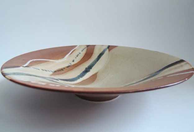
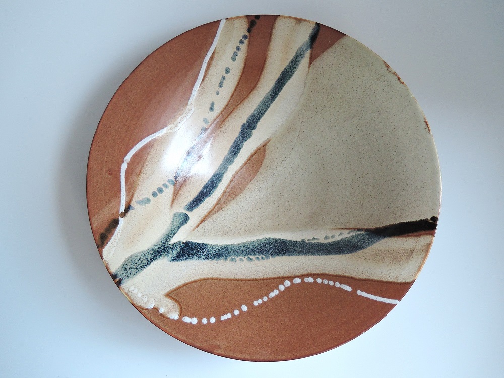
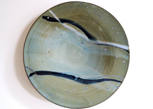
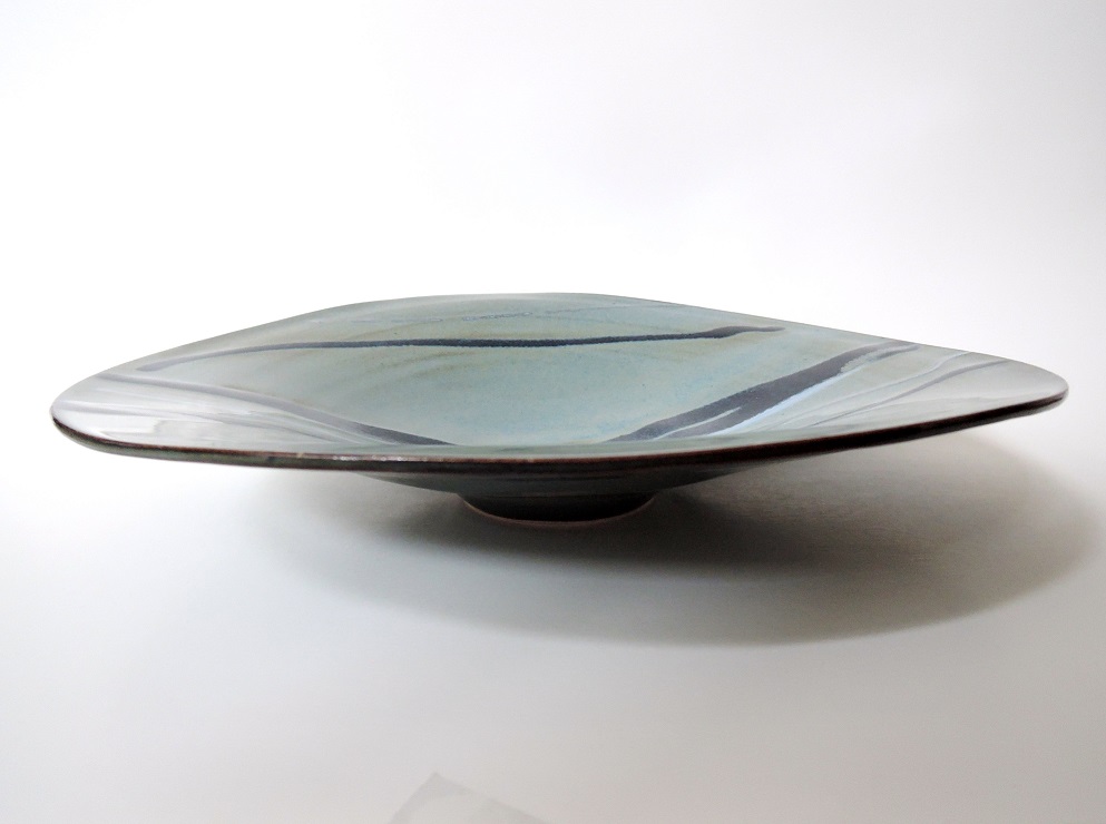
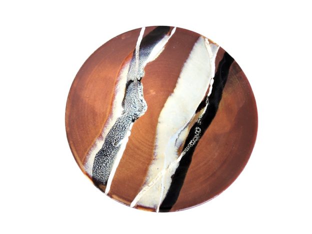
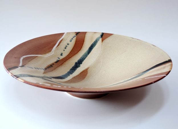
These are bowls I gave to fellow Old Girls during a Wynberg Girls’ High School reunion while I was in Cape Town in early 2020. These were among the pieces I made during the mornings I spent at Lesley Porter’s pottery workshop near Muizemberg.

While visiting potters’ workshops and exhibitions in Cape Town, I had been impressed with the use of local underglazes, and wanted to try them myself. Here I used paintbrushes in applying them to the bisqued surfaces, rather than slip trailers as I usually do when applying glazes.

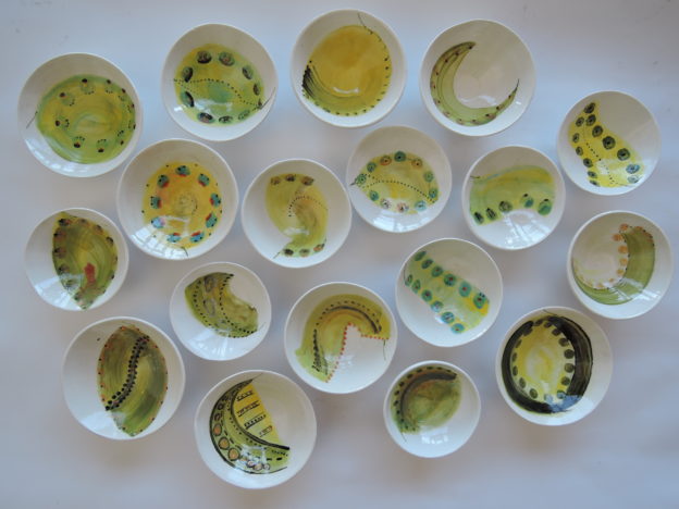
I wanted each bowl to be distinct, but for them all to form a set, so that each WGH old girl at the reunion would have one which would be paired with the others, and decorated with the same motif. Here each bowl is seen as an individual leaf sprouting from branches of one massive, long-standing tree.

Stoneware, fired in oxidation, to cone 5.

Trout Lake mugs

Why not have a decal made of a watercolour I painted during a typically Canadian weekend at a cottage on the lake? Sure, no problem, says Art Petch (Ottawa).”Let’s see how close I can get to the colours in your original.” I left it to him to decide how to convert the RGB image file to the CMYK colour profile suitable for the ceramic pigments in the printing.

On the wheel, I had thrown a series of standard, large mugs of the same height and diameter. I needed the sides to be perpendicular, to allow for a smooth application of the decal. Applying the decal should be straightforward, only requiring careful smoothing of the surface, to remove any air bubbles or water trapped beneath the film.

But mistakes do happen; they may, of course, lead to intriguing results. Once, in a moment of inattention, I applied the decal the wrong way round. The decal itself should lie on the glazed surface, with the lamination on top. Switching this around gets you an unexpected, crackled effect.

Stoneware, hand thrown; decals.

Fired to cone 6, in oxidation.

Six Miniature plates

Recently I have been using classic, hand-thrown pieces as a canvas for abstract patterns, in sets. Each piece, sufficient in itself, should contribute to a pleasing view of the whole. Each plate is small, functional, that nestles lightly in the hand. I make them to be used in everyday life: on a dining room table for condiments, or on a dresser, to hold something special. For me, the magic comes in the glazing; it’s the glazes that create something unexpected, evocative, and that catch the eye.

The initial glaze I applied by dipping the entire piece, except the foot. By the next day, with that layer dry, I applied the design by squirting a variety of thicknesses of the second orange-red glaze, which, after firing, seems to ripple over the iron-rich black glaze underneath. The very fine lines of white, shifting and moving in the melt, evoke for me white breakers at night, falling on a dark, heaving sea.

Dia: 8 cm

Porcelaneous stoneware (Frost), overlaid glazes; fired in oxidation to Cone 6

Vase

Woodfired, on its side, perched on three scallop shells.

Ht: 14 cm, dia: 12.5cm

Fired with flashing slip, and oribe glaze. A number of us from Gladstone Clayworks went out to Brenda Sutton Mader’s studio in Alexandria, Ontario, where she has her Fred Olson woodfire kiln. Snow was still thick on the ground. The kiln fired in around 8 hours. Though the oribe may be underfired (according to the cones, the temperature in the kiln varied from cone 11 at the top, to cone 9 at the bottom – this piece was placed in the lower middle) I am pleased with the rough, volcanic effect where the glaze was thick, contrasting with the smooth surface of the rest of the pot.

Fired lying on its side, on three shells, the marks clearly visible on the finished piece (below):

Ghost Gums

Porcelaneous stoneware. Fired to Cone 6, in oxidation. Dimensions

Height:: 33 cm, 33 cm, and 25 cm.

Made during the month I spent at TAFE Northern Beaches (Sydney) – Open Studio – Ceramics.

I must have spent a long time gazing at the ghost gum trees I came across while walking in in the bush along the Sydney coastline, Other trees too, like the strangler figs, were equally stunning, but the ghost gums took my breath away, with their dark, decaying bark peeling away to reveal the naked smooth-white trunk reaching upwards towards the sky: fire and ash, decay, strength, and regrowth.

Nothing came of the project I had initially put forward to Christopher James (who runs the ceramics school there) as justification for being accepted into the Open Studio. But a series of these tree trunk vases/cylinders came out instead, which made me happy.

Two cylinders, thrown; the lower part of the base then coated with a mix of slips, oxides, grit and earth from my walks, to provide texture for the breaking, peeling bark. With the cylinders still damp, I then attached the second cylinder to the first, working on the wheel to fuse them seamlessly together. I added more slips and stains further up the cylinder. Once bisqued, I sprayed a fine layer of clear glaze to the surface, and fired the cylinders to cone 6, in oxidation.

Mugs – Speckled Wave

Ht: 7 cm; dia at rim: 5.5 cm

Ht: 6.5 cm; dia at rim 5.5 cm

Audrey Blackman porcelain, fired in oxidation to Cone 6.

I threw these while taking a workshop at the Baambrugge pottery near Amsterdam, with the English potter Chris Keenan. We were to make pieces that worked together as families; these are the  two smallest from a series of increasingly large mugs. I like their shape. I can see now with hindsight, that under his attentive eye, I really paid  attention to the lines of the piece itself:  the wall narrows as it moves from its wide, sharp-angled base to the smaller rim,  and  the bottom of the handle firmly emphasizes  that first lower, lifting line.

I thought a squirt of a bright-coloured glaze would highlight the luscious whiteness of this  porcelain. Then I used a few touches of a red underglaze over the blue to further attract the eye. I poured a transparent glaze into the inside, and then, holding the mug upside-down, I  dipped the rim into the same glaze, ensuring a thicker, smooth finish where lips will touch it. To finish off the mug, I used an atomiser to spray a light layer of the same transparent glaze over the outside, giving it a sightly dappled effect once fired.

Below, a close-up of the red speckles:

Ebbing Tide

Dimensions:
dia: 30 cm
ht: 7 cm
Stoneware, fired to cone 6, in oxidation.
Glazes are applied through dipping, pouring, and finally squirting, with the aim of achieving lines of glaze combinations which reflect and enhance the shape of the piece itself.  

Setting Sail

Setting Sail 1 and 2: dia 32 -33 cm, ht: 4.5 -6.5 cm.

Won Best Design award, Ottawa Guild of Potters Annual Exhibition 2018

Trimmed while damp, the sides are carefully pushed inwards and upwards to provide the swirling distortion of the rim. The bowl is then dipped in a high-seas colour glaze, with further multiple layers of  glazes either poured or squirted onto the inner surface. A fine spray of iron-rich glaze, applied with an atomiser, provides a darker tone to the raised rims.